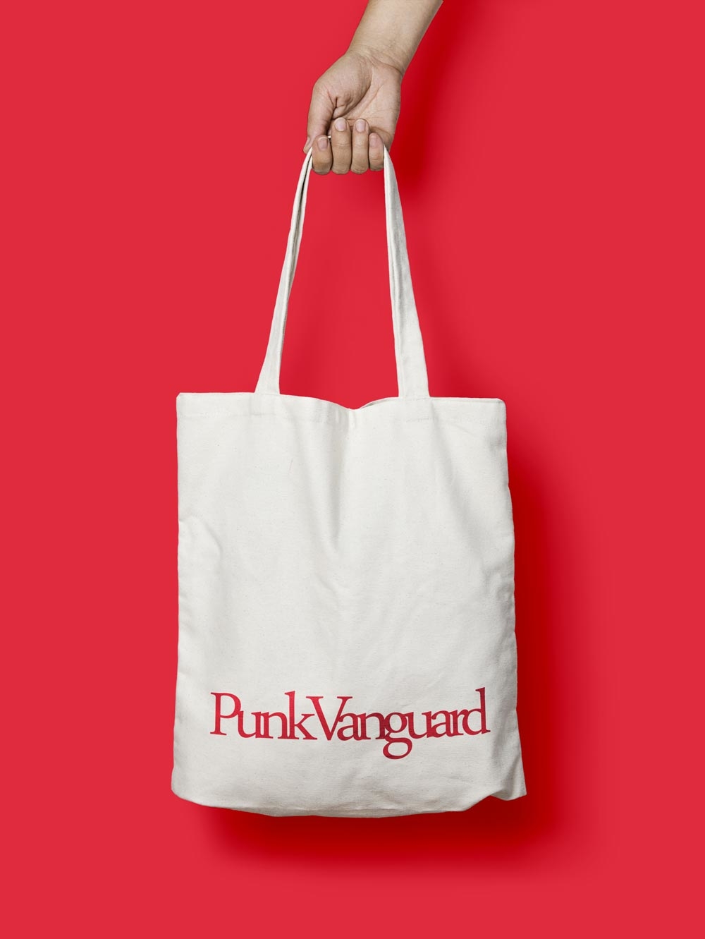
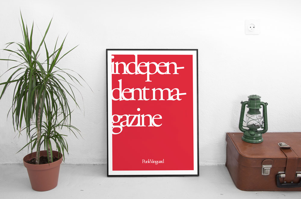
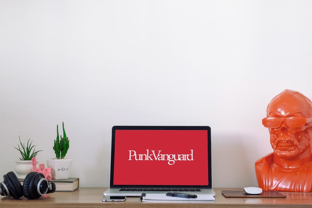
IDENTITY FOR Punk Vanguard
Something new and unique... the "classic" in an alternativa way.
The needed was: something on a singe line, short.
Something unique and different from the current logo’s trend. No more only “minimal”. The biggest magazines of the world has no minimal logos/style, a refresh classic is the solution for a completely new independent magazine. We were looking for a durable sign.
Why don’t use one of the oldest font ever to elevate the concept of avant-guard? It’s readable and useful.
Check Punk Vanguard