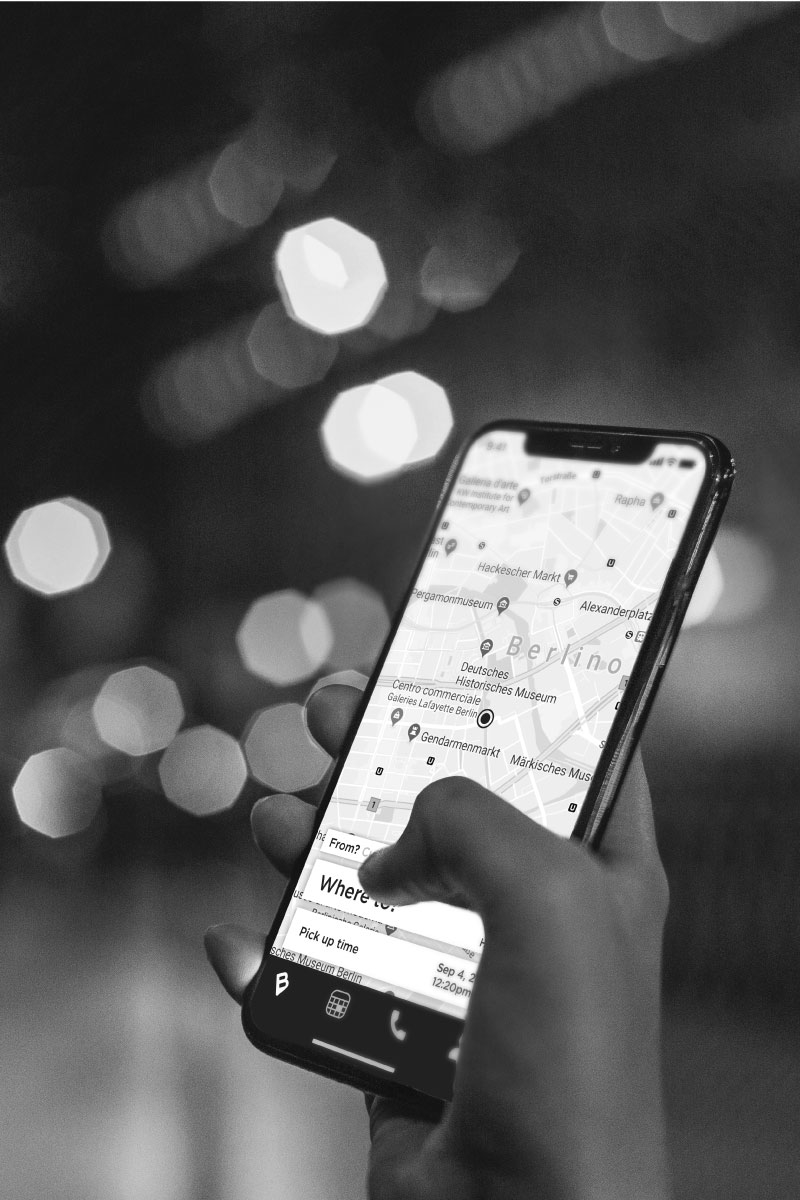
I really like the brand Blacklane and the idea behind their concept, but I am a visual designer who pays a lot of careful attention to details. There are some of their communicative aspects that I would try to fix for the public. I would like to improve the brand image and not revolutionize it, always keeping in mind Blacklane’s transparent philosophy.
Just a little bit of restyling and some simple suggestions for the app.
Logo
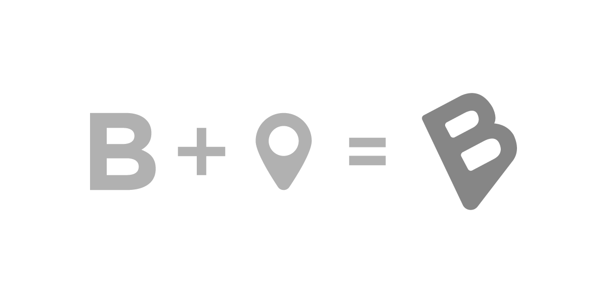
I analyzed the current logo and I tought that it just needed some fixing. The B and the pin are the most important keys of their identity, so why not integrate them better in a smart and recognizable way?

Logotype
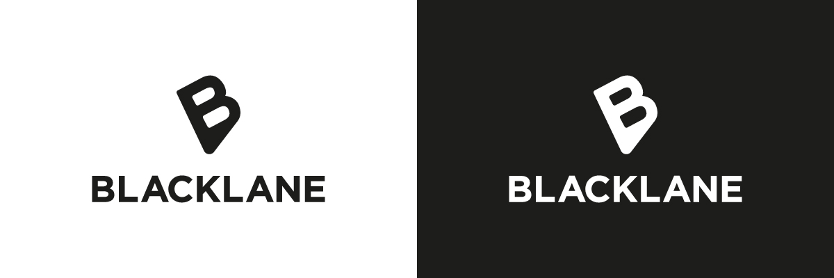
The logotype is designed entirely in Gotham Bold: no small or big changes to Black and Lane, with this solution I will have a strong single logo name.
Visually this has a strong impact and it is easier to read.

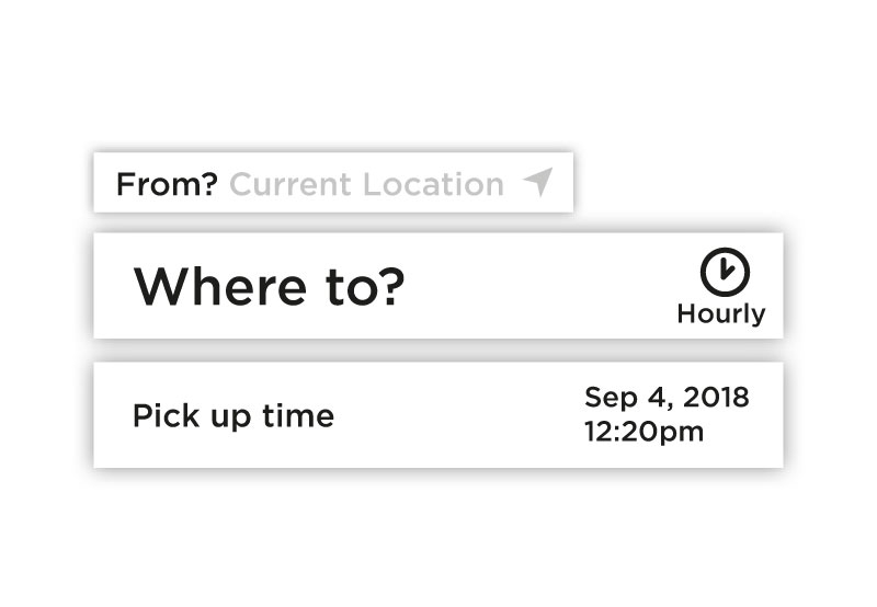
In my opinion apps like these should be simple and fast, with not too many menus. It cannot be too complicated.
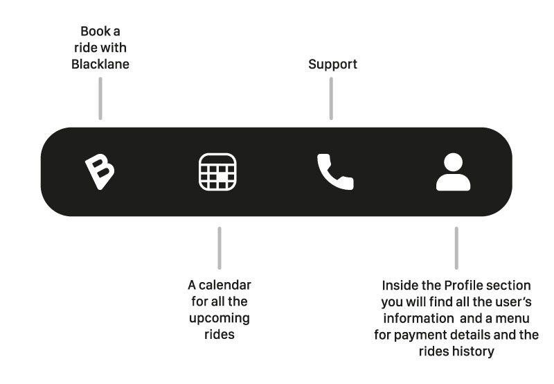
The current menu does not conform to the Blacklane style and the Payment details are not so important so as to take the space of a fifth icon.
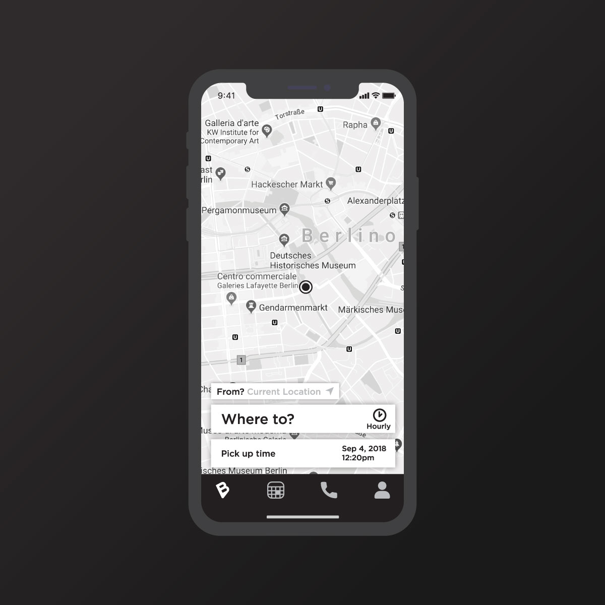
App home
The first page has to be faster and intuitive.
Once the user opens up the app, he/she has to be able to immediately book a ride.
The scale of grey could be more attractive and recognizable for the brand. Booking a ride: this is what the app is made for conceived for. So no more superfluous buttons and other steps.
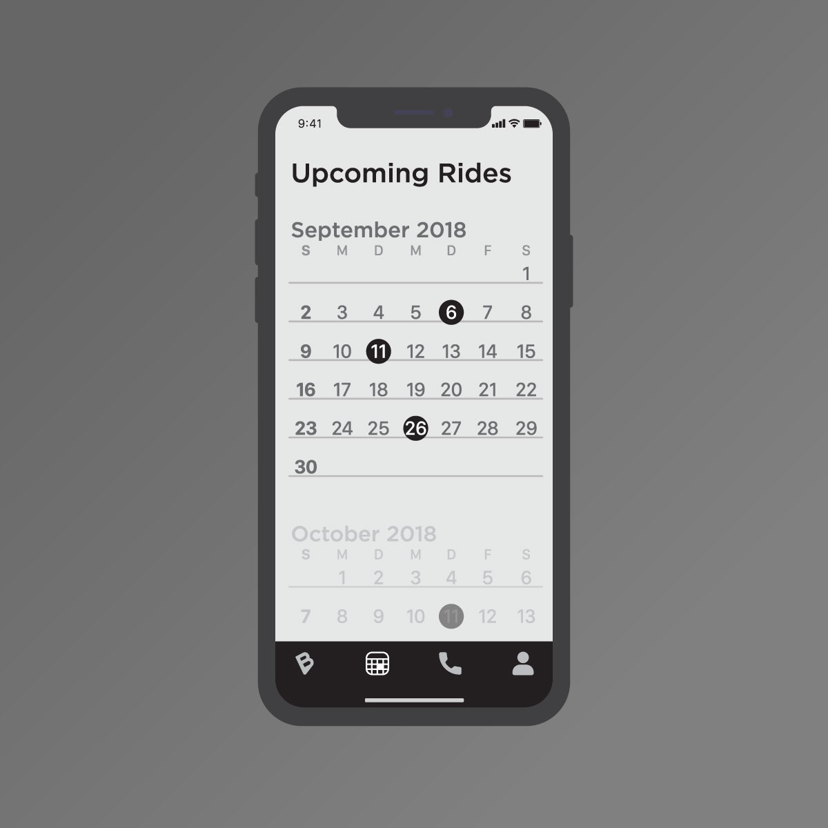
Calendar
I do not think that the entire history of old rides should be so relevant at a first glance. So in this section I would create some sort of calendar with future rides, in order not to forget them.
Here the user can also edit the upcoming rides on time.
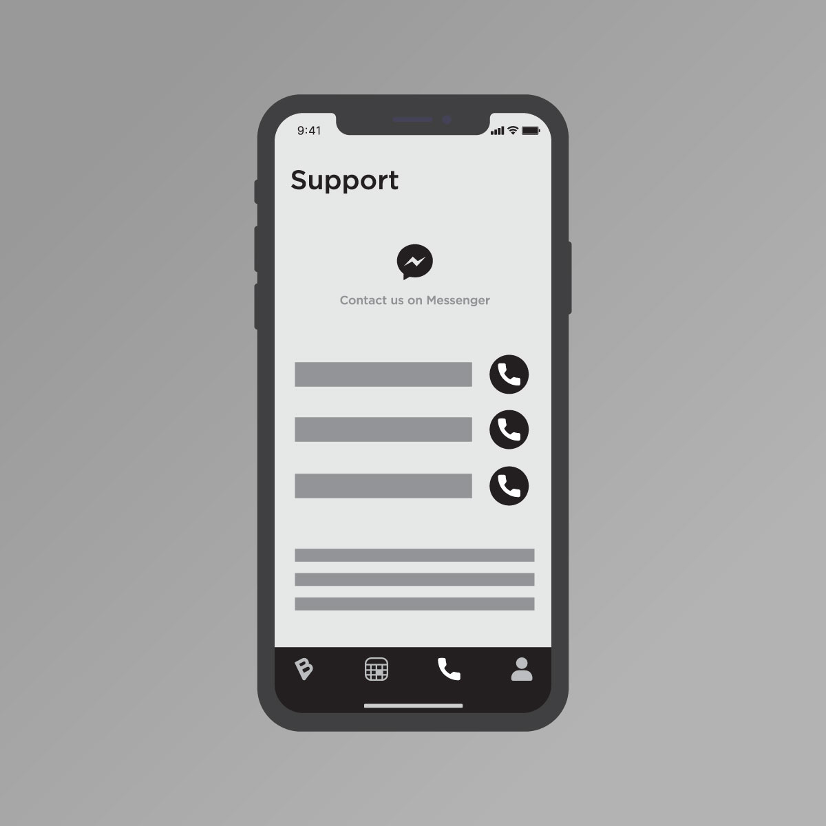
Support
Even more simple and fast, with big buttons and a clear design.
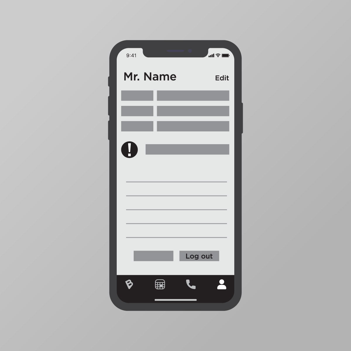
Profile
– A specific button to change the user info
– All the info like Phone, Mail, Company Name,…
– Notification setting shortcut
– A menu with other private information that the user needs. General settings, terms, payments,…
These are just some ideas that came to my mind to improve the image and the experience of one of the most powerful apps.
I like to call them communication exercises.
(for the entire analysis contact me)
